
How can we improve usability for new and returning users?
This question lead the redesign proposal for the existing application to administer condo payments.
The User Interface redesign was based on an evaluation taking into account Jakob Nielsen's 10 Usability Heuristics.
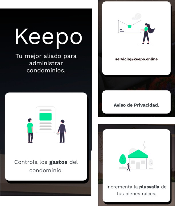
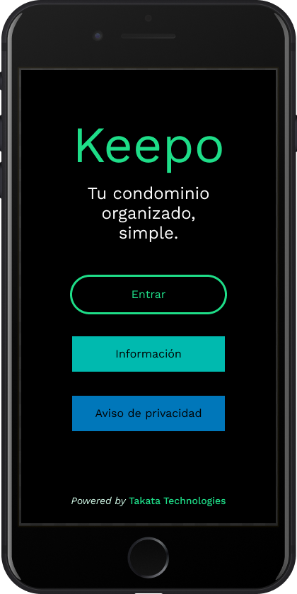
The information section is well explained and has an agile reading pace. The contact email and privacy policy give credibility and trust. Icons are informative but the hierarchy of statements can be modified to highlight the core application tasks first. It is unclear I can do different actions as an administrator and as a resident.
issue#1Severity: Low
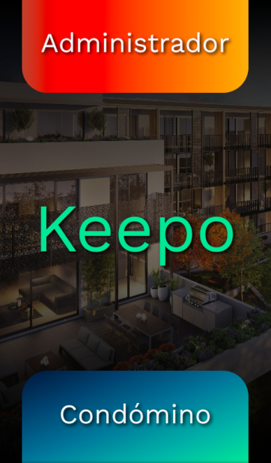
The Log in/ Sign up buttons do not reflect the aesthetics of the rest of the application.
issue#2Severity: Cosmetic
The Log in/ Sign up forms do not maintain a single language (they jump between English and Spanish).
issue#3Severity: Low
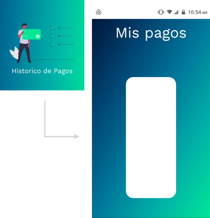
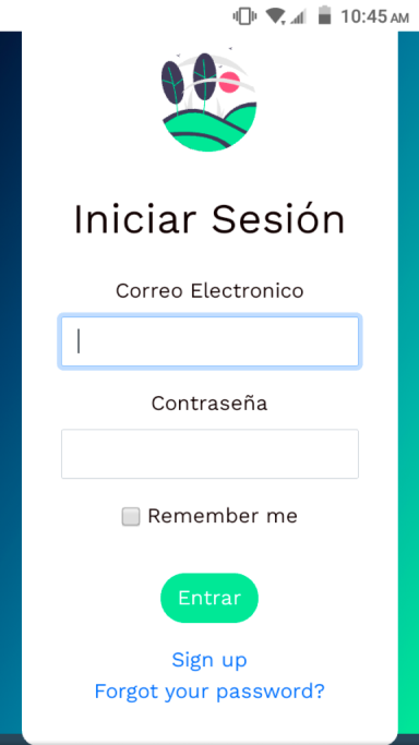
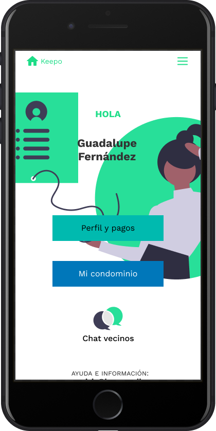
A white empty box greets the user after clicking on the payment history section. It is unclear if this is happening because the application doesn’t work or because the user has no payment record. User is unable to tell what is happening. There are no other options available to continue with the navigation flow.
issue#4 Severity: Critical
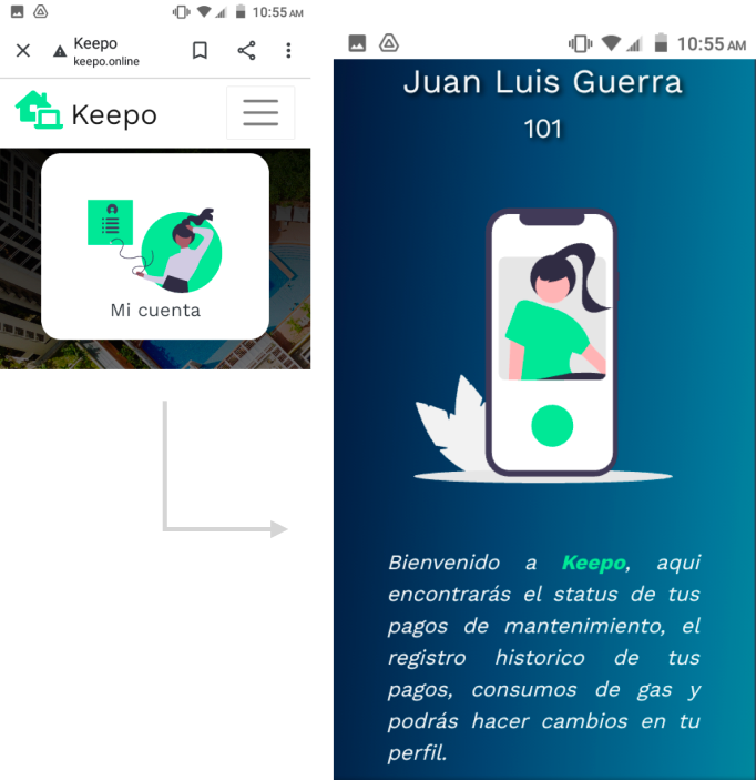
Once in My account the informative caption is useful for new users but can easily become unpleasant for expert users who already know this information. Find a way to display the caption only to newcomers.
issue#5Severity: High
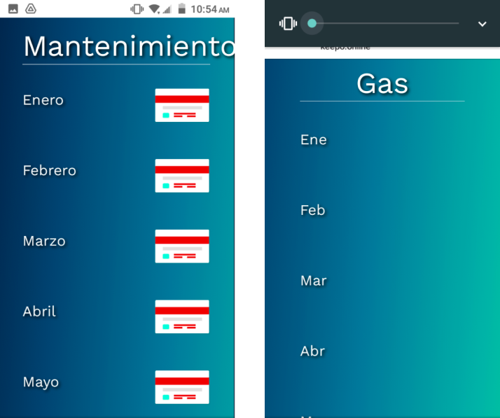
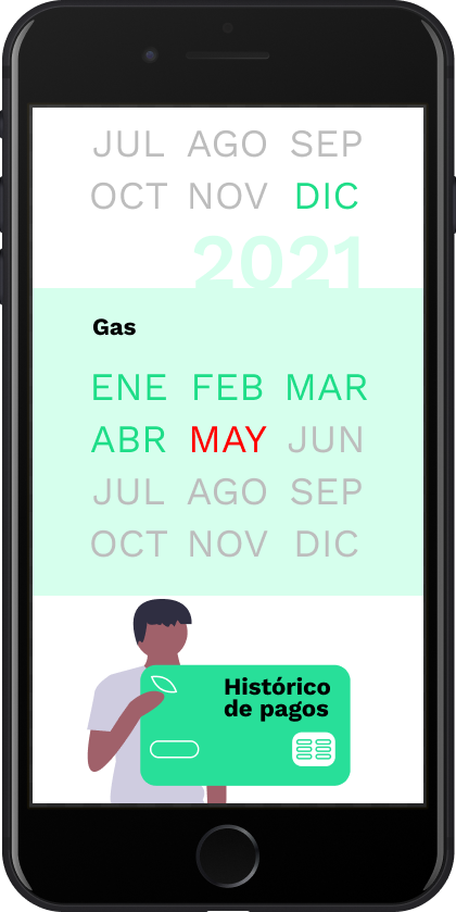
There is unnecessary and sometimes empty scrolling to find out about the payment status of services. A new visual code is suggested to concisely feature this information.
issue#6Severity: High
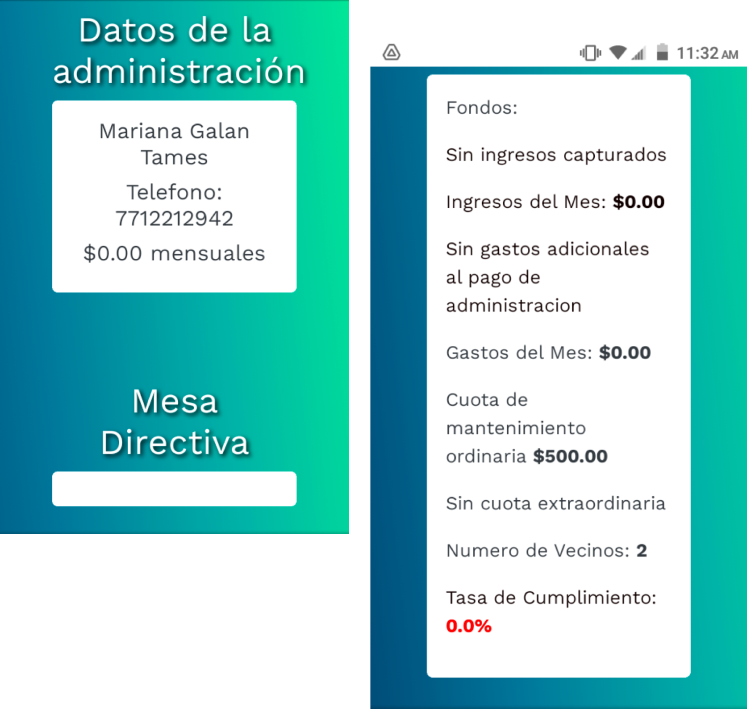
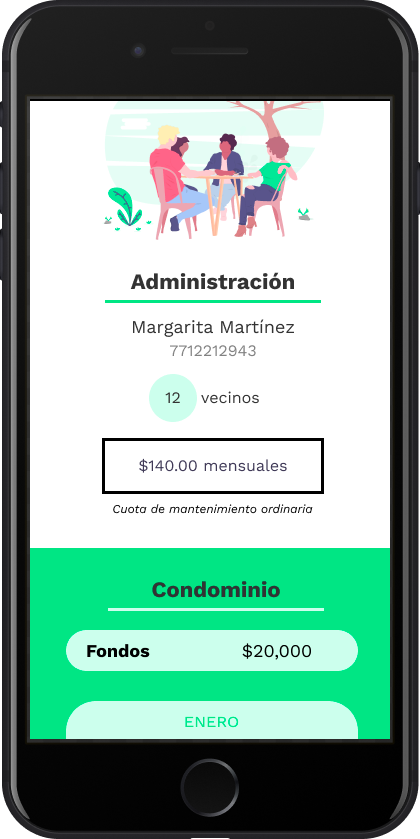
Confusing white spaces in empty sections. There is poor hierarchy of information in the administration categories.
issue#7Severity: Cosmetic
Rationale and issues tackled:
issue#1issue#4issue#5
issue#4issue#6
issue#2issue#3issue#7
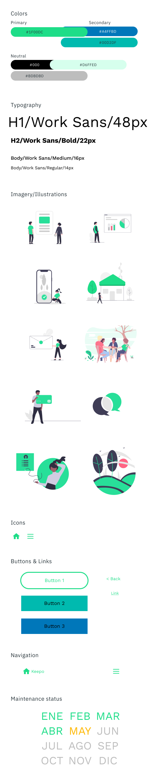
Tech Stack:
